Refreshing a trusted name in community health
Vivant Health
Vivant Health, formerly known as River City Medical Group, is a trusted and established name in Sacramento’s healthcare landscape, with over 30 years of delivering high-quality care to underserved communities. As the organization evolved, it embraced a forward-looking mission centered on innovation, sustainability, and holistic health.
With a new name selected by the board—Vivant, meaning “alive”—the leadership team recognized the need for a brand identity that could carry this renewed vision forward. However, after more than two years of working with other creative partners, they remained without an approved logo or unified design direction. The organization needed both a visual identity and a clear strategic foundation that could align diverse stakeholders and reflect the deeper meaning behind their transformation.
Our role
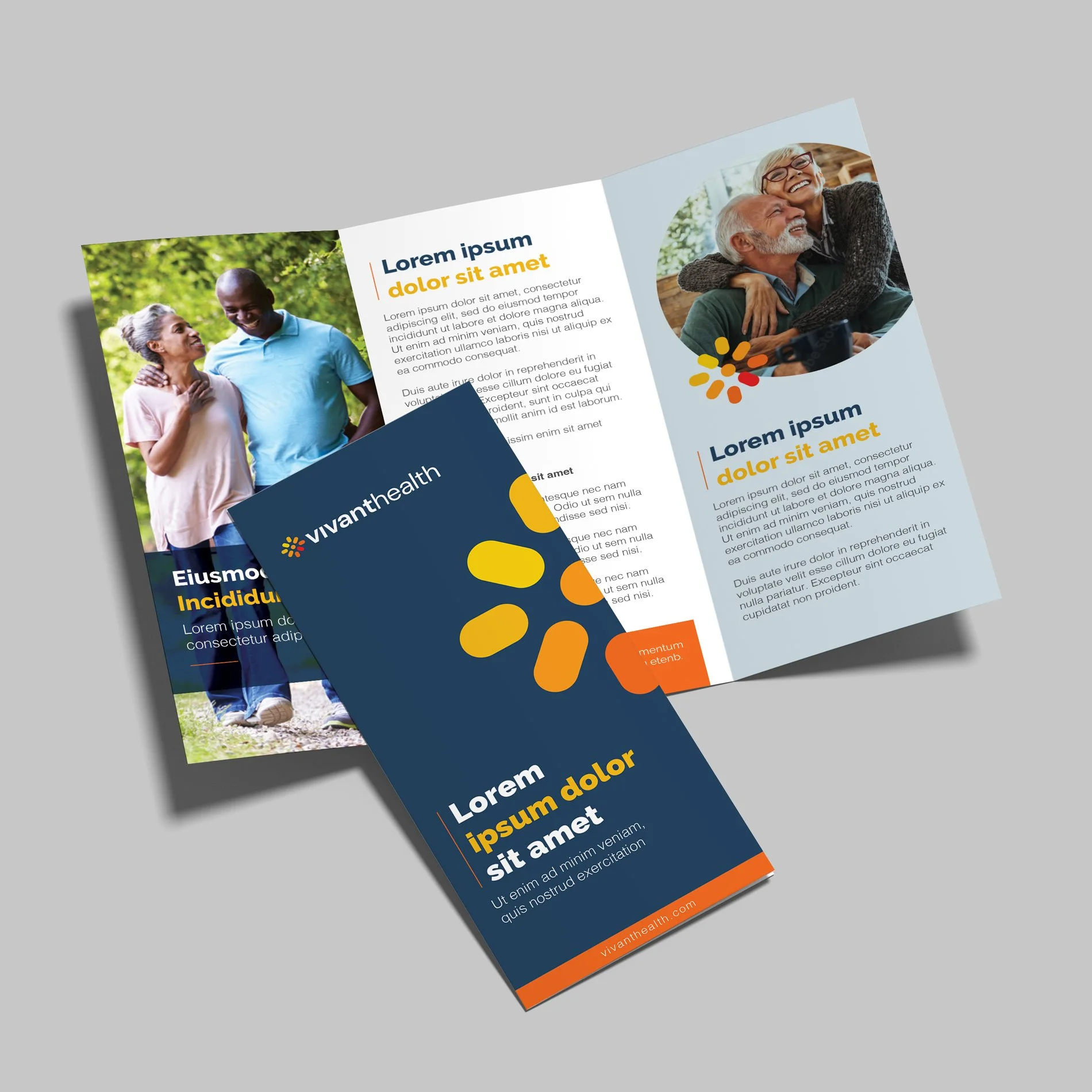
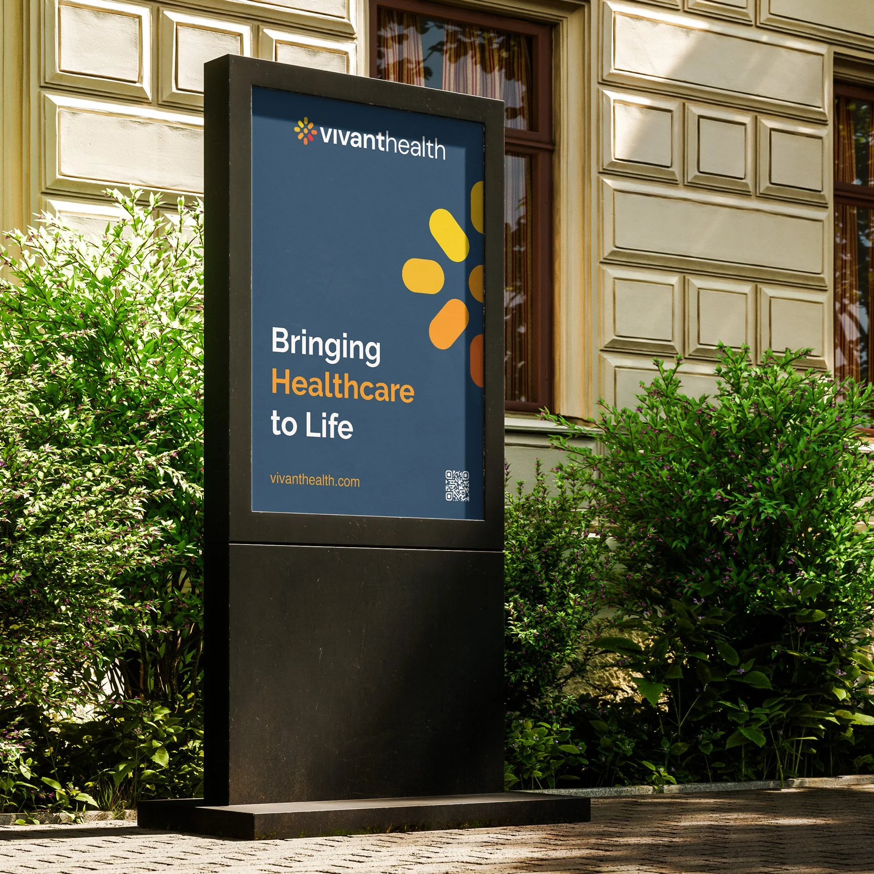
Vivant Health partnered with TCD to bring clarity, cohesion, and momentum to their rebranding efforts. Our engagement began with a brand strategy work step focused on uncovering the emotional and symbolic depth behind the name Vivant. Through collaborative sessions with the board and executive leadership team, we explored the theme of “life” and how it manifests in elements such as wind, water, air, and sun. While it was rich in metaphor, we worked to simplify and distill this into a singular, accessible concept. The insight that the sun is the essential force that sustains all other forms of life became the creative cornerstone of the new brand. This clarity enabled us to develop a modern, elegant sun icon as the foundation of Vivant’s visual identity.
We supported the organization through strategy, naming rationale, messaging refinement, logo design, and visual identity, delivering in six months what had not been achieved in over two years. Our team served as both strategic consultants and creative partners, leading collaborative work sessions and presenting directly to the board. The selected logo was approved in the first round of creative, which was a testament to the strength of the strategy and alignment process we facilitated.
Following the development of the new brand identity, we worked closely with Vivant to establish a broader brand architecture strategy. This included building a visual design system that could extend across affiliated businesses and future service lines. We created a flexible co-branding and endorser naming framework that ensured consistency, clarity, and connection to the core Vivant brand, empowering the organization to scale its presence without diluting brand equity.
Impact
The launch of the new Vivant Health brand marked a turning point for the organization, by providing a confident, contemporary identity rooted in purpose and vision. The sun icon has become a powerful symbol of life, sustainability, and care, resonating with internal and external audiences alike. The brand’s refined, modern expression has helped position Vivant as a forward-thinking leader in regional healthcare, align with its strategic goals for innovation and long-term impact.
Our work extended beyond design to deliver a comprehensive brand platform that continues to guide Vivant’s growth. The co-branding and endorser system gave leadership a flexible framework to bring other entities into the fold, which ensures that every expression of the brand, from signage to digital to service lines, feels connected, intentional, and scalable. Most importantly, the leadership team gained more than a logo, but; they also gained a sense of ownership and pride in a brand that truly reflects who they are and where they’re going.